I often wonder why is everybody jumping on the (Office like) ribbon wagon. Ribbon UI is clumsy if it isn't done properly and furthermore, if you ask me, it just isn't suited for all applications. So I came across this example of application:
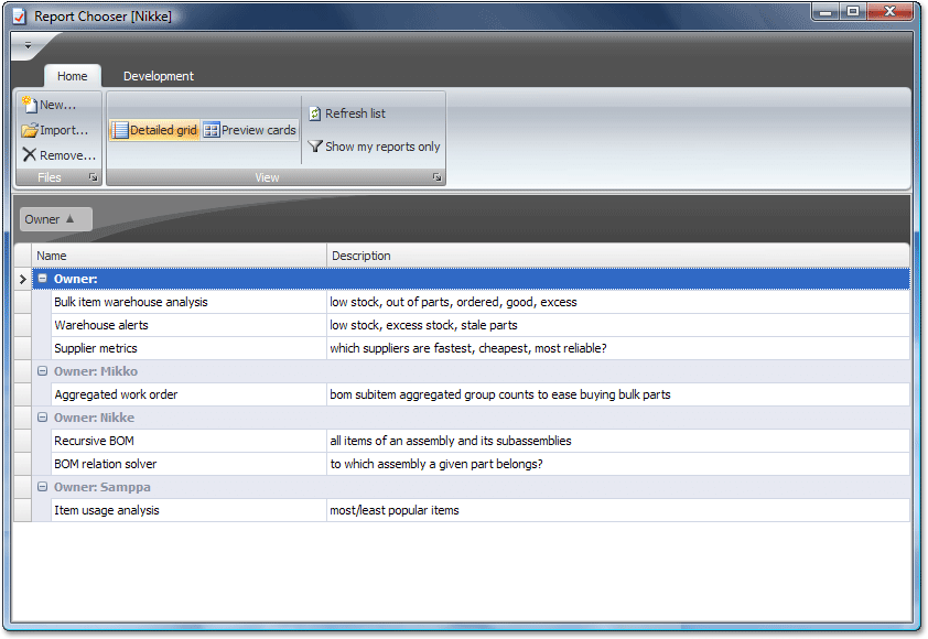
The image is taken from this "Case Study: Itagent chooses DXperience" blog post
Honestly, I didn't read entire post nor do I know what application exactly does. What caught my eye is ribbon taking almost third of the window area – ~30% for displaying a bunch of buttons is a nonsense, bad design and a sign of ribbon misuse. It is good only if you are paid by the screen area used by your application. Again, perhaps there is more to it – a broader view, but judging from the picture I can't think of anything else. And this isn't the only application that does it – there are plenty of others.
So, if you feel like you have to use ribbon, use it wisely – not just because you have to.
LOL! This is what I call “misplaced creativity”. Being cool for the sake of being cool.